Have You Heard: Pantones 2017 Color of the year is here

PANTONE-Color-of-the-Year-2017-Greenery-15-0343-leaves-2732x2048-1200x900
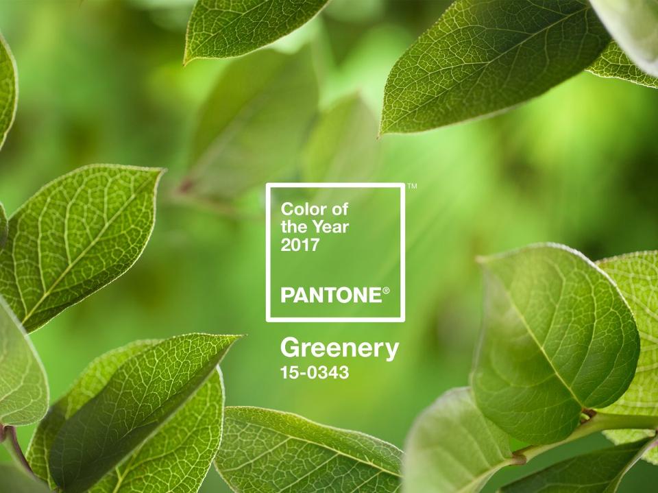
Have you heard? Pantone recently released it’s choice for Color of the Year for 2017. This symbolic selection is a color snapshot of what we see taking place in our global culture that serves as an expression of a mood and an attitude. This years choice is a vibrant and refreshing color named Greenery. Although inspired by nature, the staff is very specific about the shade describing it as “a fresh and zesty yellow-green shade that evokes the first days of spring when nature’s greens revive, restore and renew.”

“Greenery bursts forth in 2017 to provide us with the reassurance we yearn for amid a tumultuous social and political environment. Satisfying our growing desire to rejuvenate and revitalize, Greenery symbolizes the reconnection we seek with nature, one another and a larger purpose” Leatrice Eiseman

You can easily incorporate this color in your home and life to elevate your mood and to encourage new beginnings. As Pantone states, Greenery is natures neutral color and can be incorporated with many different shades including yellow, melon, purples and blues. Try these tips below to keep you up to date on trends:

  • Painting all four walls may be a bit overwhelming. Try to use it on an accent wall or kitchen back splash to give your room a refreshing look.
  • Often overlooked when trying to incorporate a new hue: add something alive! Bring plants and herbs in this bright color into your home to liven up any room.
  • Rugs, throws, tablecloths and pillows are always an easy way to stay on top of trends. They are also inexpensive and easily changed. This color will stand out even more in a neutral room.

Pantone’s staff around the world spends the year studying trends in fashion, consumer products, social media, art and technology. It looks for influences that best describe the current culture and mood in our society.

“There’s a growing desire to reconnect with Nature and what is real, and find ways to disconnect from technology. We need a break. We need to stop and breathe. “(Greenery) is about unity and community—connecting to oneself and others and a higher purpose, Nature.” Laurie Pressman, Pantone Color Institutes Vice President

Credit: www.pantone.com/color-of-the-year-2017 and CNN.com

How to make Pantone’s 2016 color of the year work for you

Experts at the Pantone Color Institute are hinting at upcoming mellowing & calm trends with their choice for this years Color of The Year. Recently for the first time ever they anointed two colors; rose quartz and serenity were selected as the dual colors of the year for 2016 (they are shades of pale pink and baby blue). The pairing can appear solo or as blended shades.

pantone-2

In the words of Leatrice Eiseman, the Executive Director of the Pantone® Color Institute: “Joined together, Rose Quartz and Serenity demonstrate an inherent balance between a warmer embracing rose tone and the cooler tranquil blue, reflecting connection and wellness as well as a soothing sense of order and peace.”  Rose Quartz is persuasive, gentle and conveys compassion and composure while Serenity compares to the blue sky and provides relaxation.    Read on to see some simple ways you can incorporate these two tones into your home.

35983055_066_b
Paisleys And Damasks Pillowcase Set from Urban Outfitters

Add printed throw pillows throughout your home. Using a pattern that has both colors create a stunning display especially when placed against a neutral background. 

flat,550x550,075,f.u6
Rose Quartz & Serenity Poster


One of the easiest ways you can stay on trend is to hang art on your wall. Art can be easily changed and if you think outside of the box it can be fairly inexpensive. Think old prints, posters, thrift store finds and tapestries. You could paint frames in these tones as well to subtly incorporate this new trend. This poster to the left uses both colors in a pretty design.


isa-ikat-yarn-dye-table-runner-c
Ikat Printed Table Runners

Table clothes can be easily incorporated into your home with little to no struggle. We love this printed patterned table runner from Pottery Barn.

B9320151786Z.1_20151218111555_000_GDDCT02UP.1-0

                                                                                                                                                                                                                                                                                        Adorable accent pieces such as this chair are perfect for incorporating these colors. Think stands, dressers, and bookshelves. You can even upcycle things you already have or come across.

rose-quartz-serenity-copy


                                                                                                                                          You can see how well the two colors compliment each other and blend in this awesome dresser. Blending the colors adds depth and personality as opposed to having just one flat color and takes full advantage of both of the tones. 

contemporary-bedroom

                                                                                                                  Probably at the top of my list for most favorite uses of these colors is this wood paneled wall splashed with Rose Quartz. The wood panels give this hue a beachy and rustic vibe and creates something extremely unique. You could simply paint one wall to create an accent wall in your home with either of the colors. To prevent overkill and to break up the color adorn the wall with mirrors or photographs. 

1289-Front_exterior

Since trends are always changing we recommend incorporating these colors in smaller pieces as opposed to diving head in. However the designers of the above house have used Serenity Blue so delicately that we don’t think the homeowners will ever fall out of love. You can consider incorporating these colors in your outside decor by changing your siding, painting your shutters or adding window boxes painted with these tones

download

We also love this Rose painted door. A bolder move but it works so well! 

Once people get over the inevitable baby nursery comments, I think we will easily see a lot of possibility for design.  Pastels are extremely versatile and can appeal in all finishes: matte, glossy and metallic. Incorporating these colors into your home can help to create a calm and relaxing environment.

What do you think of  Rose Quartz and Serenity? Do you see yourself incorporating them into your home decor? Why or why not? Leave your comments below!