Experts at the Pantone Color Institute are hinting at upcoming mellowing & calm trends with their choice for this years Color of The Year. Recently for the first time ever they anointed two colors; rose quartz and serenity were selected as the dual colors of the year for 2016 (they are shades of pale pink and baby blue). The pairing can appear solo or as blended shades.
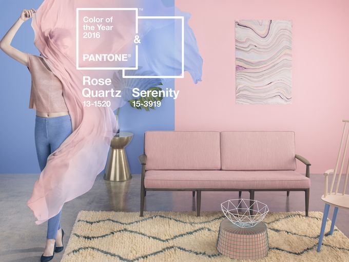
In the words of Leatrice Eiseman, the Executive Director of the Pantone® Color Institute: “Joined together, Rose Quartz and Serenity demonstrate an inherent balance between a warmer embracing rose tone and the cooler tranquil blue, reflecting connection and wellness as well as a soothing sense of order and peace.” Rose Quartz is persuasive, gentle and conveys compassion and composure while Serenity compares to the blue sky and provides relaxation. Read on to see some simple ways you can incorporate these two tones into your home.
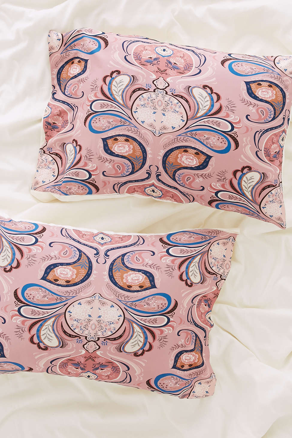
Add printed throw pillows throughout your home. Using a pattern that has both colors create a stunning display especially when placed against a neutral background.
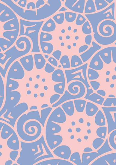
One of the easiest ways you can stay on trend is to hang art on your wall. Art can be easily changed and if you think outside of the box it can be fairly inexpensive. Think old prints, posters, thrift store finds and tapestries. You could paint frames in these tones as well to subtly incorporate this new trend. This poster to the left uses both colors in a pretty design.
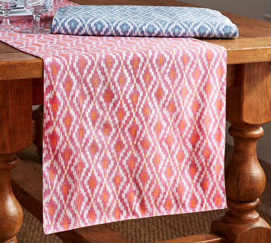
Table clothes can be easily incorporated into your home with little to no struggle. We love this printed patterned table runner from Pottery Barn.
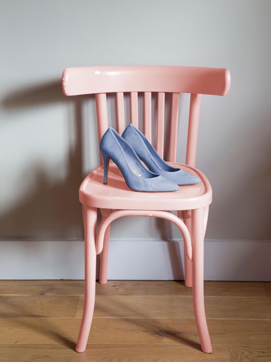
Adorable accent pieces such as this chair are perfect for incorporating these colors. Think stands, dressers, and bookshelves. You can even upcycle things you already have or come across.
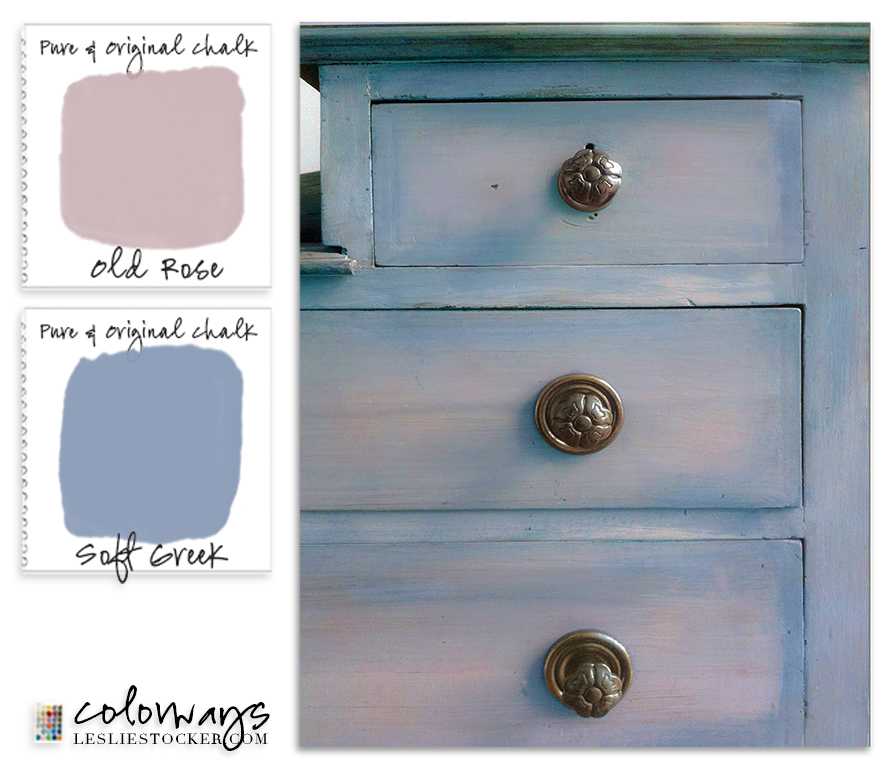
You can see how well the two colors compliment each other and blend in this awesome dresser. Blending the colors adds depth and personality as opposed to having just one flat color and takes full advantage of both of the tones.
Probably at the top of my list for most favorite uses of these colors is this wood paneled wall splashed with Rose Quartz. The wood panels give this hue a beachy and rustic vibe and creates something extremely unique. You could simply paint one wall to create an accent wall in your home with either of the colors. To prevent overkill and to break up the color adorn the wall with mirrors or photographs.
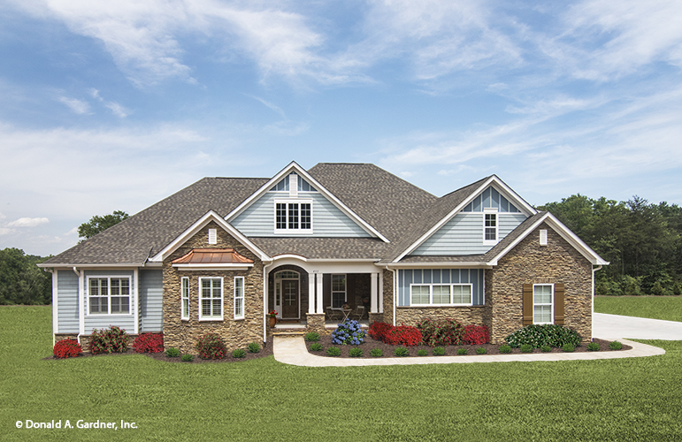
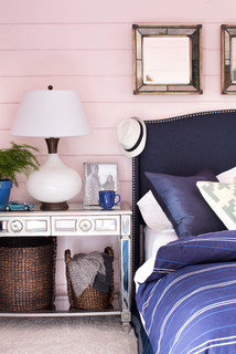
Since trends are always changing we recommend incorporating these colors in smaller pieces as opposed to diving head in. However the designers of the above house have used Serenity Blue so delicately that we don’t think the homeowners will ever fall out of love. You can consider incorporating these colors in your outside decor by changing your siding, painting your shutters or adding window boxes painted with these tones.
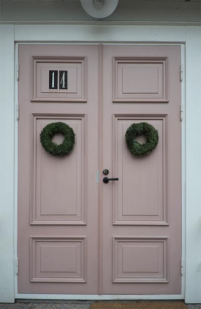
We also love this Rose painted door. A bolder move but it works so well!